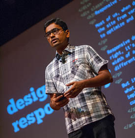
A 2-day hands-on workshop on understanding Responsive Web Design and creating websites that work flawlessly on mobile, tablet & PC.
Responsive Web Design
September 3rd (Tuesday) - 4th (Wednesday), 2013, Bangalore.
9:00 AM to 5:00 PM
This workshop will be most useful to someone who understands CSS well, but has limited experience with Responsive Design.
Limited seats! (Check out the last edition)
Registration
Early geek Price Rs. 6000/-
Available till August 20th, 2013
Regular Price Rs. 7000/-
Available till September 2nd, 2013
Your ticket includes entry to the workshop, food and any course material provided by the instructor.
Buy ticketsVenue
No. 24, 1st floor,
Krishna Reddy Colony,
Domlur Layout, Bangalore 560071
Prerequisites
- CSS Basics will not be covered. We will dive right into creating a fluid & flexible layout built with floats and then build on that to create a responsive layout.
- You understand how CSS floats work
- You are capable of building a website from scratch without using libraries like Twitter bootstrap or Zurb Foundation
- You have worked on at least 3 small to medium sized websites or 1 large one.
Focus
- Build great responsive web designs from scratch
- Create bulletproof designs that will work in every smartphone, tablet & PC, regardless of screensize & resolution
- Create robust code that works well and is easy to maintain
Arpan Chinta - About me

"I started out as a print designer back in school, and later moved to web & UI design. I've been working as a web designer & developer with HordeSoftware for the past 8 years.
My first introduction to Responsive Web Design was around a couple years ago, and I immediately fell in love with the idea. Designing one site that adapts and works in every device!? That's perfect!
I put the idea into practice right away and worked on a few responsive sites right away (http://www.ideadevice.com/, http://rubyconfindia.org/2012/, http://rubyconfindia.org/2013/ ) and I also invested a lot of time in learning everything I could about creating great responsive sites. I've shared a little of what I've learnt at RubyConfIndia & MetaRefresh and plan to share a lot more through this workshop."
(twitter) | (github) | (HasGeek)Course content
Visit the funnel to leave your comments on the content. Based on the comments, we're open to tweaking the content a little.
- Getting Started
- Building a simple flexible grid
- Introducing @media queries
- converting the flexible grid to a responsive layout
- Using SASS & Susy to simplify a responsive grid
- Convert layout to a Mobile first responsive layout
- Using Box-sizing to simplify calculations
- Testing on a mobile
-
Mobile First
Why is designing for the mobile first so important? And how do we do that? How is designing for the mobile web experience different?
- Mobile First planning
- Challenges
- Performance
- Optimizing for touch
- RWD Design patterns
- Column Add/Drop: A single column mobile layout is gradually converted to a multi-column layout as the screen size increases | eg:http://ideadevice.com
- Column Split/Merge:eg: http://thegreatdiscontent.com/
- Layout Shift: Change the layout significantly for different screen sizes.eg. http://foodsense.is/
- CSS Layout libraries
- A short discussion of the advantages & disadvantages of a few layout libraries
- Twitter bootstrap ♣ Zurb Foundation ♣ SASS & LESS ♣ Susy ♣ Compass
- Mobile First Navigation
- Content First, Source Order & other best practices
- Simple Navigation: short list & long list
- Complex Navigation: multi-level navigation
- Keeping track of Page Context
- Finding my way back
- Responsive Modules
- Responsive Content: A flexible article module (eg: http://thegreatdiscontent.com/) with: title,body,author + metadata,blockquotes,images + captions and footnotes
- Slideshow: A responsive slideshow with * images , captions & links (requires JS & jQuery), with element animated individually & at different speeds (eg: http://www.ideadevice.com)
- Forms:Designing fieldsets, legends, labels, errors & hints to be responsive
- Tables: Optimizing tabular content for mobiles.
- Advanced RWD Design techniques:
CSS3 layout modules for the present & future
- Display:table
- Flexbox
- Grids
- Multi-columns
- Region
- Best Practices
- Defining Breakpoints:Creating sensible breakpoints
- Performance
- Cross-device & Cross-browser support
- Testing: browsers, emulators & devices
- Challenges
- IE 7 & 8: using polyfills: htmlshiv , respond.js , yepnope.js, modernizr.js
- High res screens: retina image sprites, font icons, CSS3 effects
- Responsive Images with RESS
- Organizing your CSS:
- Writing structured CSS/SCSS with all these features in a way that is flexible & maintainable
- Organizing file structure
- Working with media queries
- Legacy support
- SASS
